Méjico

Name: Méjico Restaurant & Bar
Location: Sydney, Australia
Design: Juicy Design


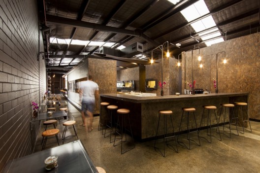
While Beasleys may have forgotten the design, Méjico is a great example of a space with a fully thought through design.  Using the menu as their starting point, Méjico emphasizes tradition, ingredients, and differentiates itself from the influx of Mexican restaurants popping up throughout Australia. 


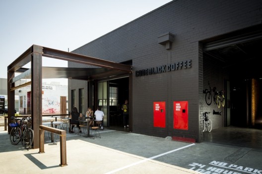
The use of bold color and pattern grabs your attention the moment you walk in and sets the tone for an urban, and slightly unexpected experience.


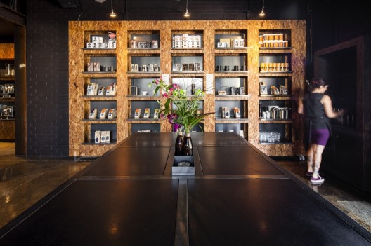
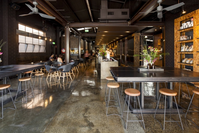
What I enjoy the most about the design is that all of the details were thought of and addressed. The empty space under the banquette seating is filled with alcohol boxes. It's a subtle detail that most might not notice but addressing it elevates the space and adds an additional moment to drive their message home. 


The hand crafted and raw aspect of the space is also a great contrast to the pattern and color and ties back into the raw and hand crafted nature of the cocktails and food being served. All aspects play together to create a cohesive feel and experience for their space. 


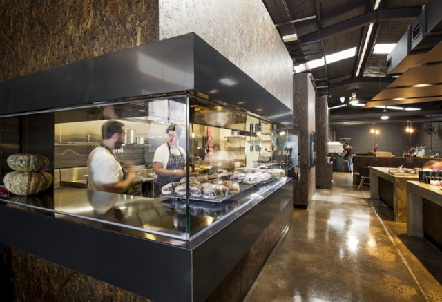
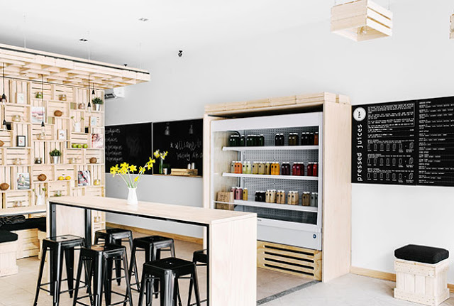
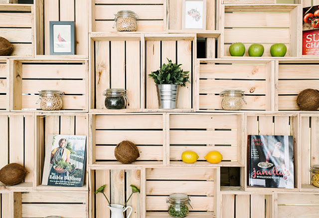
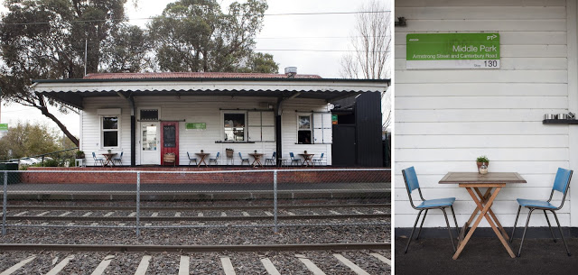
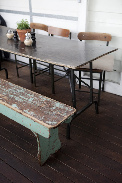
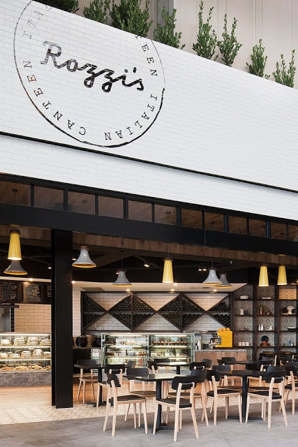
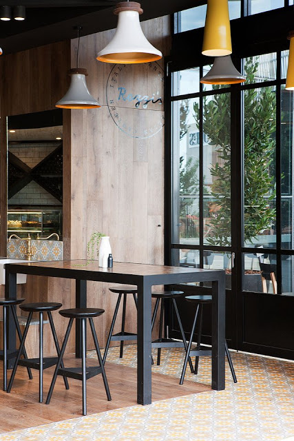
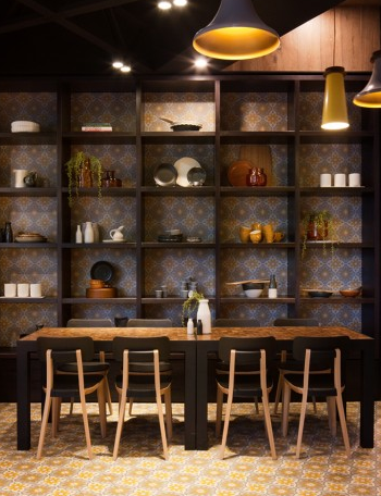
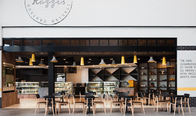
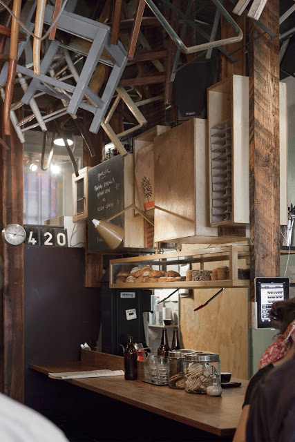
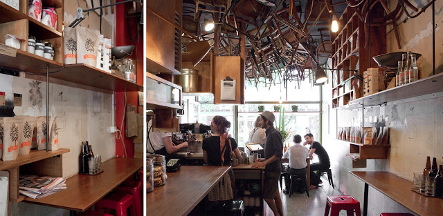
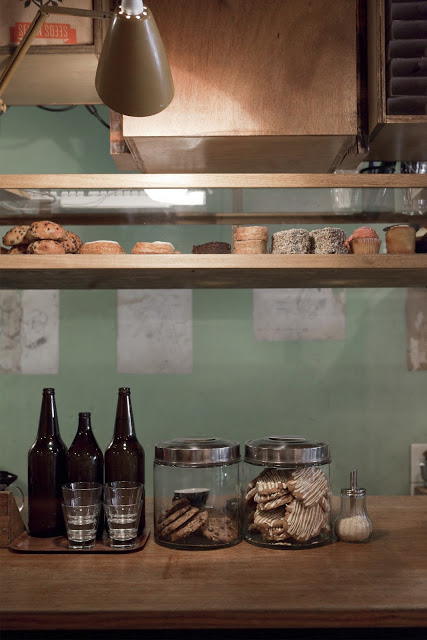
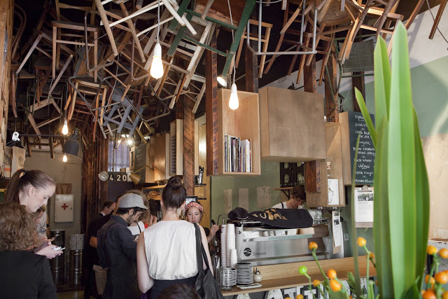
All images © Contemporist

Code Black Coffee

Name: Code Black Coffee
Location: Brunkswick, VIC, Australia
Design: Zwei Interiors Architecture 


Utilizing an industrial warehouse shell, Code Black Coffee has created a raw, lab-like space that clearly demonstrates their passion for the bean. 


Utilizing concrete, fiberboard, steel, and brick creates an industrial and urban feel throughout the space. 


Each element within the facility, from the food preparation, coffee roasting, and serving are all clearly defined and remain open allowing guests a level of transparency into their operation. 


Utilizing exposed bulbs and pipes, the lighting display over the metal wall-hung tables is a great reinterpretation of the ever popular exposed bulb and pip trends. 


All photos © Michael Kai for Archdaily

Pressed Juices

Name: Pressed Juices
Location: South Yarra, Melbourne VIC
Design: Unknown


As the juice trend continues to expand throughout the world, I love seeing these shops & cafes step up their interior. Creating an environment that matches the product being sold is critical in the food industry today and Pressed Juices created a space fitting with their brand. 


The minimal color and material palate creates a calming and cohesive space. This use of simplicity allows the vibrant colors of their product to be front and center. 


The creative use of materials provides a large visual impact, adds extra storage and display space, and drives home the hand crafted and organic feel of their company. 


Photos © Booke Holm for Share Design

Mart 130

Name: Mart 130
Location: Melbourne, Australia
Photography: Erika Hildegard Photography (If you are in Australia, I encourage you to check out her amazing range of work.)


Mart 130 has to be one of the best examples I've seen recently of a comfortable and established cafe maintaining a well curated interior. When Erika's images landed in my inbox I couldn't help but get excited. Rarely do you find the blend of well loved antiques that is also still pulled together and edited. 


Using vintage and antique pieces, paired with a nautical and industrial undercurrent, Mart 130 creates a cohesive blend of worn comfort and bright openness. 


Utilizing red, aqua, black, and blue throughout the multiple seating areas ties the entire space together without needing to match everything. This allows the space to remain cohesive while each room still maintains it's own identity. 


I love the bright back patio featuring painted, dark wood and slat ceiling, you could easily sit for hours.


Rozzi's Italian Canteen

name: Rozzi's Italian Canteen
Location: Melbourne, Australia
Design: mim


Rozzi's is an italian eatery with a focus on fresh, modern cuisine. The interior of the space reflects the menu and features a modern, and vibrant interior. 


Utilizing a limited color and material palate allows the space to come together easily while the added typography and wording adds an additional creative element.
I love the use of concrete tiles to tie the yellow and grey through the space while the addition of bookcases adds a homey element emphasizing the desire for diners to feel at ease within the space. 


The use of subway tiles and wood all keeps the space on trend and hip but I love that they added a few new elements to make the space truly unique and fresh.


All images via mim design & yellowtrace

Chez Dré

Name: Chez Dré
Location: South Melbourne, Australia
Photography: Erika Hildegard 


Located down an inconspicuous-looking alley in South Melbourne lies a boulangerie and patisserie. Melbourne based photographer, Erika Hildegard, recently sent us some lovely photographs of their space and we couldn't wait to share. 


Located in a former warehouse, the space still manages to feel warm and inviting with industrial nods. 


Designed as a lab, where pastry chef Andrea Reiss could play with flavors and combinations, the space retains the lab-like quality by keeping the shell of the building minimal and placing emphasis on displays and service areas. 


The touch of green throughout the space adds energy and vibrancy to the otherwise neutral palate and the wood tables, chairs, and coffee bar top all add a touch of rustic warmth. 


One of my favorite aspects of the space is their use of seating groups and space planing to create various intimate moments within such a large space. 


 All photos © Erika Hildegard

Fonda

Name: Fonda Mexican
Location: Melbourne, Australia
Design: Techne Architects


Fonda Mexican's second location showcases a great example of a modern, vibrant interior utilizing texture and a minimalist color palate.


The modern and clean lines of the existing structure translate well to the the rest of the space and add an element of vibrancy and excitement. Juxtaposed with just a few rustic touches throughout *wood countertops and bar front primarily) adds just enough balance to warm up the primarily white space. 

All images © Weheart

Wee Jeanie

Name: Wee Jeanie
Location: Melbourne, Australia
Photos: Erika Hildegard Photography


Located close to the Yarraville train station, Wee Jeanie is a great spot to grab your morning coffee. 


The interior is bright and classic with minimal details and allows you to feel as if you are sitting in your own kitchen, sunshine streaming through the windows. 


The exposed, worn brick adds a touch of warmth to the otherwise white space while the stacked bond tile add a slight modern touch.


I love the bright back patio and how they bridged the interior and exterior with a leaning edge on both sides. The acrylic table top and wood truss base also point the subtle modern/rustic mix happening throughout the space.


Town Mouse

Name: The Town Mouse
Location: Melbourne, Australia
Graphic Design: A friend of mine


Once again, a great example of typography and identity going hand in hand with restaurant design. The Town Mouse, located in Melbourne, took a simple color palate and created an interior that was relevant, fun, and modern.


The central bar allows for a multitude of activities while also providing a great amount of seating.


I love the square, gloss tiles that were used throughout the space. They create cohesion and deliver a great backdrop for the typography.


Images 1,4-7 © Broadstreet
Images 2,3 © A friend of mine

Brother baba Budan

Name: Brother Baba Budan
Location: Melbourne, Australia
Photography: Erika Hildegard


Located along the tiny alley of Little Bourke Street, Brother Baba Budan is a small cafe with a big personality.  


Having a small footprint, creativity is shown through the use of common materials, in this case; chairs, used in uncommon ways. By placing the chairs on the ceiling, it creates a texture and pattern and draws the eye up, emphasizing the spaces height. 


Placing shelving and displays at a higher vantage point also frees up the floor space they do have to allow for quick grab and go coffee and a small community table in the center of the space.


Using wood as the primary build-out material and leaving the walls relatively raw, they were able to create a hip and urban space that keeps the focus on the coffee.


 All photos © Erika Hildegard